If a picture’s worth a thousand words, then designs with words must be worth a little extra, right? I think so. I’m a big fan of t-shirt designs that rely heavily on typography or lettering as a main design element. There’s no second guessing the meaning or thought behind a type tee – it simply is what it is. I wanted to take this opportunity to give props to some of my favorite Threadless type-based tees. (Oh and hey, side note, even if you’re not a designer, you can create a type tee with Threadless’s Type Tees app!)

Mathiole does it again. This design won the ’80s design challenge because it IS the ’80s. Lens flares, multiple gradients and extra rad brush-style lettering on the word Rad really makes this a totally tubular tee.

Another challenge winner, this time from the 3D design challenge, by Eric Zelinski is really well done. The letterforms and the faux-3D effect work well together. Additionally, the juxtaposition of the message against the design itself is very clever.

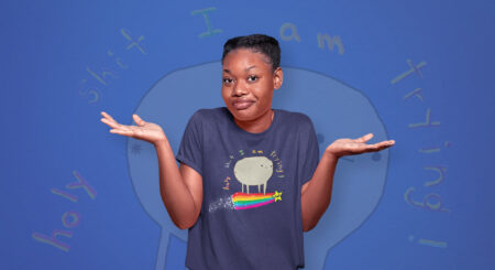
Katie Campbell is one of my favorite Threadless artists. Her styles may vary but the quality of her work is top notch. I really dig the brushy feel of the hand lettering in this design and the modest rainbow over the first Y is perfect. The light distressing technique adds some great texture the reinforces the handmade feel of the design.

Props to Jaco Haasbroek for creating this super fun, minimal type-based design. The use of the O’s in cool as the eyes harkens back to one of Jaco’s earlier designs but it’s such a clever idea, it’s good to see it in action again. The arcing of the Stay text looks great on the back of Mr. Cool’s hat. This is one of those designs that would look awesome on any combination of ink and tee color.

Warning: Shameful plug ahead.
I may be a bit biased here but I LOVE this design. When brainstorming ideas for the Big Lebowski challenge, I kept coming back the classic “The dude abides…” line at the end of the movie in the bowling ally. Then, that old magic light bulb went off in my head. I typeset the word Abide in all caps and replaced the I with a bowling pin. I added a light distressing to the design for a vintage look and the rest is history. I wear my Abide tee often and think it looks pretty darn good. But that’s just like, my opinion, man.