Hi. My name is Jordan, and I’m a bookaholic. I’m not sure when it started, or why, but it’s gotten to the point that I have entire rickety, Swedish-designed bookcases in my home filled with the musty devils.
I… I can’t stop. I tell myself I will – I have to – and then I see a bookstore, one I’ve never seen before, beckoning me, calling me… seducing me.

Before I know it, I’m dragging home a wagonload of random tomes that would’ve been considered ancient when Genghis Khan stole Australia from the Nazis (I don’t know a lot about history).
The subject or genre of the book rarely matters (I will read anything); I just love the smell of the pages, reading the notes scribbled in the margins, judging the last person on the check-out list who clearly stole the book and sold it.

One of the niftiest things about old-timey books for me, and the reason that I’ll never stop collecting them, is the art they can inspire in my own work. Whenever I’m stuck for a unique idea or flair, I just crack open one of my many-paged friends and look for inspiration; the hunt never fails.
Sometimes it’s a chapter head illustration that flicks the switch; sometimes it’s the use of a font, or even just the beat-up exterior of the book itself that gets the juices flowing.
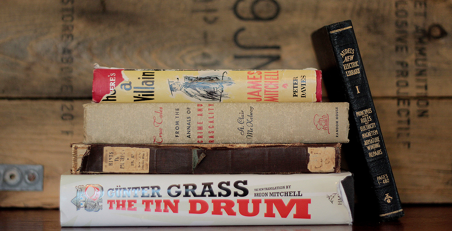
You know what? I’ll prove it to you. I’ll pull some random books off my own shelves right now, and I’ll bet I can find five elements of kickass vintage book art to give your next design that certain je ne sais quois*.
(*French for ‘paper-cut filled with 1920s gangster bacteria that hurts like a thousand fiery suns’.)
1. Typography, a.k.a. ‘Judging a Book by its Cover’
I know, I know… you’re not supposed to do that. Bad Jordan. *light wrist slap, girlish giggle*
Still, folksy idioms aside, you can tell a lot about a book by its cover. Never was this truer than with “True Tales from the Annals of Crime and Rascality”, a collection of… well, true tales about crime and ‘rascality’, which I assume is when you say bawdy things to a woman of good breeding whilst wearing a fancy hat.

The stories themselves are hysterical in their old-timey-ness, as well as what was considered ‘crime’ back then (think petticoat theft and monocle-poppery), but the real gem for me was the cover of the book itself.

The use of color is an obvious choice; the red-and-black scheme is a classic noir-crime color palette.
The fonts are a bit more counter-intuitive. While the last two sentences are done in a predictable all-caps, thick-lined font (as befits stories about cops and robbers), “True Tales” was printed in a curly, flowing script worthy of Chaucer or Dickens.
Those curly bits make it feel less like a bunch of police paperwork and more like an adventure book, starring spats-wearing Ocean’s Eleven gangs.
This cover taught me that even the lightest touch can change the entire “feel” of a design. If the entire title had been done in that thick, business-like font, it would have hit the eye so much more dully.
2. Embellishments in Vintage Manuals, a.k.a. ‘Grandad Bear-Smacker’
My grandfather (who, for the sake of this article, we’ll assume was 9 feet tall and got just, like, all the girls), quit school at an early age to become an electrician, back when that meant stringing massively heavy, dangerous cables from one end of a valley to another by hand, presumably while punching a bear right in its stupid face with the other hand.

- ‘You want another one? Keep walking, Smokey.’ – my grandpa. (Image courtesy of Google)
Still, as bear-smackingly manly as he was, my g-pop realized that working with electricity is hilariously dangerous. So, he got himself a set of manuals that would teach him everything he’d every need to know about Zeus’ stray farts.

- ‘Excuse me’. (Image courtesy of Google)
These travel-sized books are called the “Audels New Electric Library”; the volume I received to hang on to is called “Principles and Rules of Electricity, Magnetism, Armature Winding, Repairs”.
Now, that’s just about as boring a title as you could possibly scrape together out of words from the English language. The book’s cover, however, more than makes up for it:

The radiating lightning bolts, while kind of a grim reminder that as an early 1900s electrician, you toy with death on a daily basis, are objectively super-badass.
Other than that, though, the “Electric Library” seemed outdated and useful only as a memento from my dear, departed ancestor. However, when I realized that one of my favorite video games of all time, Bioshock, was set around the same time period (and had nothing in the way of decent shirts for fans), I decided to dig a little deeper and see if I could get any insight into the era through my new “How Not to Die a Crispy Death” manual.
The lightning bolts were an obvious tie-in to the Bioshock weapon, “Electrobolt”; basically Force Lightning times a million. Add in the use of fonts and the slanting placement, and I had found the inspiration for one of my first and still most-popular designs, “Electrobolt“.

And only the cover itself inspired this design! Once I dug deeper, I found illustrations of antique machinery that I could use for any number of mad-scientist-related art projects:

Tell me that you couldn’t use some of those ridiculous machines in that bitchin’ retro sci-fi/My Little Pony mashup you’re putting together.
Perspective, sense of motion, artistic nuances specific to the era of hand-drawn scientific illustrations… it’s all right here, in these kinds of manuals, just waiting for you. Thanks, Grandpop.
3. Symbolic vs. Realistic Illustrations, a.k.a ‘The Dinklage Effect’
I chose ‘The Tin Drum” by Günter Grass for two reasons; first, it’s a story about a mute, autistic dwarf in WWII-era Europe who communicates by busting sick drum solos on the tin drum he wears around his neck, and can cut through glass from a hundred yards with his piercing scream.
Why he’s not already an X-Man, I don’t know. I vote Peter Dinklage to play him, in case anyone at 20th Century Fox is reading this.
The second reason is because of how the main character himself is illustrated:

Diminutive? Check. Tin drum? Double-check. Mouth open in a glass-obliterating shriek? Triple-friggin’-check, yo.
So many times, an artist can be tempted to go as realistic as possible in their art, especially when it’s a character they see so clearly in their own heads.
There’s an argument to be made for keeping these illustrations intentionally vague, though; namely, it allows the viewer to create the character in their own mind, and put that version of them through the events of the book.
My version, for whatever reason, looks like Tyrion Lannister.

Bottom line; try a piece of representational art instead of immediately going for photo-realism. You might be surprised at how effective it is.
4. Impressionist Art, a.k.a. ‘Go Easy on the Details’
Sort of in tandem with #3 is this: if you’re going to illustrate people, unless you’re going for photo-realism…

…maybe go easy on the details. For example, check out this awesome watercolor illustration for James Mitchell’s 1957 character study “Here’s a Villian”:

Rather than give us a photo-worthy rendition of London, the illustrator has instead chosen to give us just a sense of things. The main character himself, clad in black, looks supremely grouchy and irascible (as befits a ‘villain’).
The woman next to him is just a smile, two eyes and some… hair? Or does her actual head taper off into nonsensical swirls? Is that a genetic thing? Doesn’t matter.
Look beyond the two main characters… the bicyclists are just a few lines, and all the buildings are filled in with simple dabs of watercolor, instead of painstakingly-detailed bricks and shadows.
All in all, sometimes less is more. Keep that in mind for your illustrations, and you can probably take your art up that extra notch.
5. Distressing, a.k.a. ‘A Little Grunge goes a Long Way’
One of my very favorite design tricks is the ‘distressed’ look, and nowhere can you find better inspiration for distressing than in old books.
What was once a proudly-crafted spine is now, after decades of page-flipping and being shuffled from place to place, a cracked, worn-out, glorious mess:

See how time and human carelessness do it, and then find some free Photoshop distress, grunge and dirt brushes (they’re everywhere), and go nuts on a design you feel just needs a little…something.
Distressing lets you take even the lamest, most-generic logo you’ve ever seen…

At at least punch it up to “the crushing blandness doesn’t make me want to immediately and spectacularly kill myself” levels:

Boom. 65% less generic, 100% more awesome.
There you have it, five inspiring elements found simply from five random books off my many, many shelves. Just think about all the awesome design inspiration that’s sitting on the shelf of your local bookstore, gathering dust. (Hint: You should go check them out.)
Now, if you’ll excuse me, I have some rascality to commit.