
Break out the baseball raglans – the Cubbies are back, baby! It’s the Cubs’ opening day today and given that our HQ is in the Windy City, we can’t help but be pretty excited about this post-win season. As Chicago nerds and art nerds alike, what better way to celebrate the Cubs season kicking off than by celebrating the art of the team?
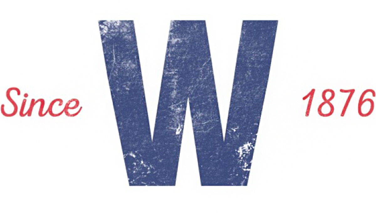
You don’t have to be a sports fan to appreciate the design aspect of over a century of team logos. In fact, if you ever feel frustrated about an art project you’re working on, browsing through team logos throughout the years is a great way to remind yourself that art is an evolution. Even something as simple as the ‘Fly the W’ flag – the flag that’s raised every time the Cubs win (and is found in many-a-window here in Chicago) – switched from a white W on a blue background back in the ’80s.

While the Cubs debuted their new mascot Clark (see above) just a few years ago in 2014, the team’s actual logo has remained unchanged since ’79 (also see above on the front of Clark’s jersey). But they’ve had over 100 years to land on the design we see today and as you can imagine, the logo changed a few times in that century.
In the first 15 years of the Cubs’ existence, the logo was about as basic as a logo can get, playing around mostly with font style but not much else.

From 1916-1936, the Cubs got a little more experimental with their logo, from revamping the little bear image, to creating something that looks pretty much exactly like a repainted version of today’s Chicago Bears logo (we like our woodland predators here in Chicago).

Only in 1927 on do we see something more like the modern Cubs logo start to take shape…literally.

And now, here we are!
It’s pretty cool to look at the logos of yesteryear and be able to pick out the elements they decided to keep, ditch, or improve and expand upon; especially when you have an artist’s eye! But something that’s equally cool is seeing how fans take popular sports logos and images and give them their own spin out of love for the team, adding to the art of, well, sports!

Do you have a favorite sports logo? Favorite story behind a logo? Want to talk about the Cubs? Let’s hear about it in the comments!
Original logos and logo year info via sportslogos.net