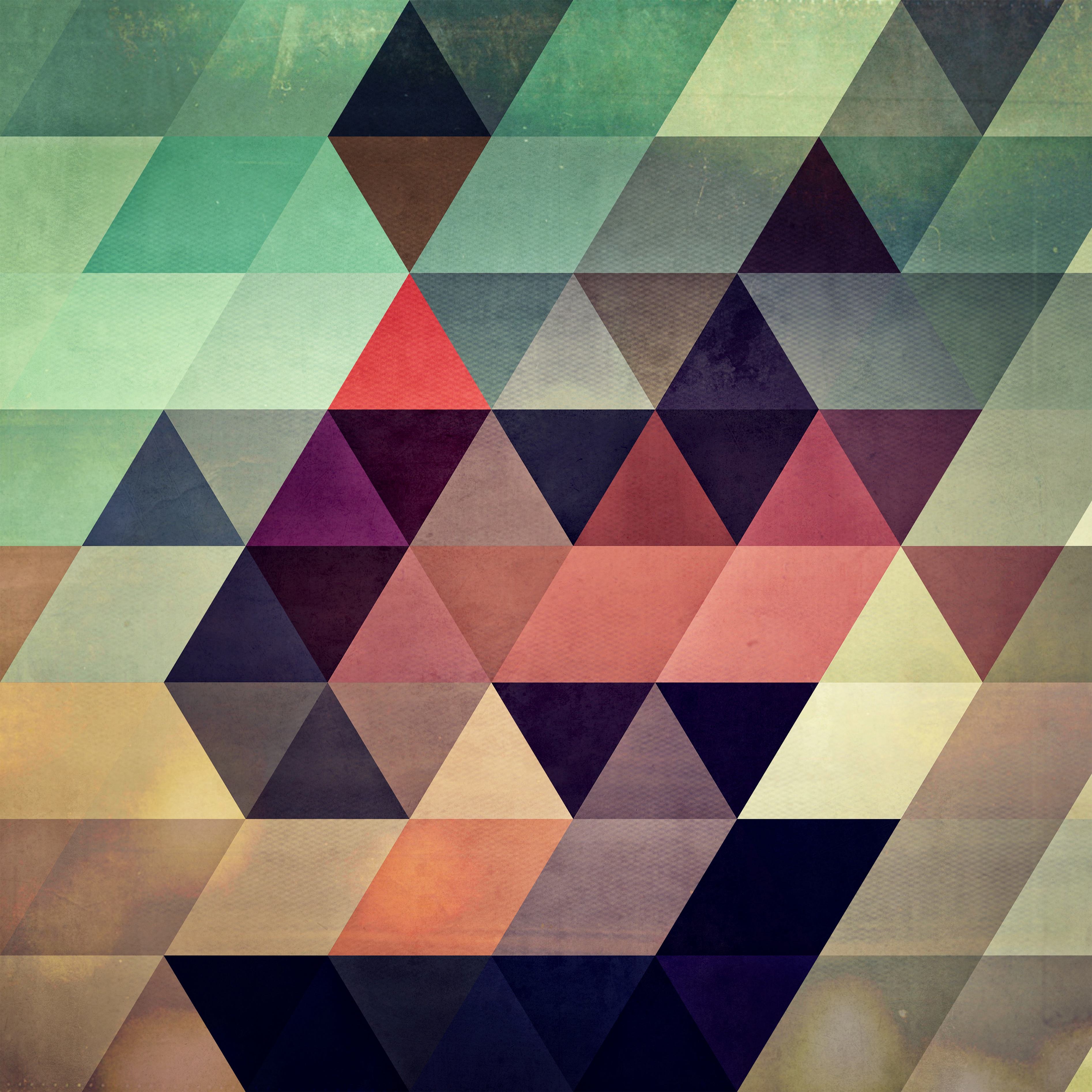
Interested in minimalism and inspired by the beauty of geometrics, artist James Soares creates colorful, textured pieces rich in depth,  impact, and illusion. The ultramodern is a driving force from conception to execution; Soares works primarily by mobile, and is guided largely by self-expression, style, and personal taste. Publishing his work via the name Spires, he recently debuted his designs on a new platform: Threadless Artist Shops. Read on to learn more about Soares, and check out his Artist Shop here!
Hi, James! Welcome to Artist Shops. Why don’t you tell us a little bit about yourself?
Hey there, I’m so glad to have this opportunity. I’m a graphic designer who makes digital art on my iPhone. Spires is the brand and artist name I use to publish my design and art. Most of the art is made using apps on iOS. I love printing, so I have a giclee and risograph studio in New Bedford, MA. Having been printed at Threadless many years before, I’m grateful and happy to have an Artist Shop here.

Have you always pursued art, or is your work a talent you’ve recently discovered about yourself?
I’ve always pursued art. After searching for a long time, I found my niche. I had been experimenting with abstract geometry for years, and finally put all the pieces together to form my typical style in 2012. The mobile approach to art liberated me to become much more prolific and explore colors endlessly, which inspires me.
What drew you to geometrics?
Geometry is flexible, powerful, and beautiful. Aesthetically, geometrics reflect my interest in minimalism as a lifestyle. The abrupt, hard shifts between colored shapes represents a conceptual negotiation of my perceived limits. The rhythm and scale of the geometry creates structure and impact, and allows me to incorporate graphic design. Geometry is also marketable, so it works to help support myself as an artist.

Your work combines shape, value, and texture – what role does each element play in your designs?
Shape creates a scaffolding to which I can attach a mood. Value creates depth and sometimes optical illusion, and along with color, creates impact and hopefully engages the viewer. Texture is the tactile element that best suggests context.
How do you manage to take a structured, mechanical art like geometrics and insert a random, organic quality?
I use the juxtaposition of artificial and organic as a way to explore the idea of authenticity. Texture, color, and value are important in creating organic qualities. Sometimes I think of the works as prisms that reveal an organic, complex chaos within the rigid geometry of each piece, that create a visual metaphor for my personal experiences.

You say your work acts as a “vehicle for color”. How do you approach color in your pieces, and what influences your ultimate decisions?
I live for color, and feel as though it is my core competency in art. Color is my aesthetic compass, giving me a direction while sailing a wild sea of new apps and approaches to creating on mobile. Approaches to color vary based on my mood, or what my goals are for that session of work.
Beginning with a loose guideline about what colors should be featured, I can explore within that framework until I unlock how those colors are going to exist together. Texture is built simultaneously with the coloring of the work and becomes integrated into the colors themselves.
Each piece is a color puzzle that I work through to my goal. Ultimately, my artistic guides are self-expression, style, marketing and personal taste in varied proportions.
What’s your typical process when creating your pieces?
Starting with an idea for a color palette that I’d like to explore, I create a scaffolding of shapes that feature those colors. Then comes depth for impact and illusion, blends for beauty, texture for context, tone for mood, and then I tweak these until I have something worth sharing. Across different styles this process varies, but each element is usually included.

Why do you prefer working digitally vs. by hand, and what do you find to be the advantages and disadvantages of this choice?
Working digitally makes me more effective where I’m naturally attuned, allowing me to build on my strengths. I enjoy working with technology. I’m fascinated by developing new, more efficient workflows while still achieving sufficiently varied results. Working on mobile makes for better, faster aesthetic decisions because the tools are intuitive, ergonomic and immediate. What would have taken me hours in Photoshop now takes me minutes on mobile.
Creating art by hand wasn’t always enjoyable for me. It’s fun using machines or computers to learn or discover efficient processes to create images. The mobile approach has become a great advantage. Workflows that deliver quality results are as much a part of my art as the shapes or colors I choose. For example, I frequently race against the phone’s battery. I’ll start many times at the 20% warning and set a goal to finish before 5%; the 10% warning helps me gauge progress.
The disadvantage to mobile is potentially getting rusty on the desktop, so I develop print materials for Spires to practice graphic design skills, and make occasional illustrations to practice vector skills. Making hand-stained and textured Risograph posters is an outlet I have for making work by hand.

What do you believe your designs bring to their surroundings, whether it’s via home decor or clothing?
Watching friends and acquaintances have discussions about how they interpret a piece showed me that the work provides an introspective moment for the viewer and an opportunity for creative conversation. The freedom to interpret an abstract image in a way unique to the viewer helps create engagement. Going back to the image and discovering new optical illusions keeps the work novel. The wide variety of available designs allows someone to find a piece to coordinate with their space. I aim to make beautiful work, so hopefully beauty is brought along as well.
The designs bring a contemporary, trendy, modern style to apparel. The variety of designs allows the viewer to coordinate outfits according to their color preferences and their existing wardrobes. An effortless and attractive combo accessorizes a shirt with a device case that shares the same design.
If you had to choose – what’s your favorite shape?
The isometric grid isn’t a shape per se, but that’s the closest answer.
The Spires logo is assembled from triangles on an isometric grid. Considering the isometric grid helped me earn the freedom to make art full-time, the logo contains modified concentric hexagons, symbolizing an integrated life. Resembling a heart, my logo represents gratitude for the independence obtained through doing what I love.

Any other shout-outs?
I am grateful to Threadless for giving me the opportunity to be featured! I’ve been away for some time but it feels great to come back and be included as part of your Artist Shops. I want to thank the community of print on demand artists who have supported Spires, and the customers who have been so kind as to purchase my art and make it part of their lives!


