Have you heard the traveler’s complaint? About how all places are merging into one beige blend of global brands and trends, and no single place is distinct or different from the next? I think it’s been around as long as travel itself. It’s similar to the old lament about ‘kids these days’, or worries surrounding the evils of the internet / television / radio / the printing press – and it’s as misleading as those, as well.
Over the past decade or so, I’ve had the privilege and pleasure of traveling often, and I’ve found every country and every city I’ve visited to be infinitely distinct. Yes, the differences are found in the obvious: food, culture, rituals, and daily lives lived. But they’re also in the design, look and feel of a place – a big part of which is signage, fonts, and typography. If you stop to look, letters are all around you, telling you something about a place.
Hong Kong is one of my most favorite cities in the world, and features some of the most eye-catching signage you’ll see worldwide. It shouts at you, vying for your attention, colorful and electric, in this city alive with energy and buzz. Like Hong Kong itself, it’s a mix of old and new, Chinese and western, garish and restrained. Here’s a little taste:

Hong Kong is synonymous with neon signs, for good reason. They flash and glow in city streets, big and small. If you want to see more, this website celebrates and documents Hong Kong’s neon signs and it’s well worth a visit.


One of my favorite things to do in Hong Kong is catch the Star Ferry. It’s cheap and gives you the best view of the city on both sides of the harbor. The actual ferry terminals are gems in themselves too, especially the pier at Tsim Sha Tsui with its glorious Art Deco curves, metal frame windows, and mix of stencilled and hand-painted signage.

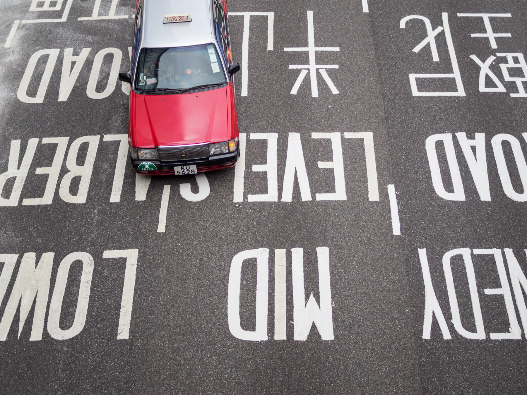
You’ll notice the (bilingual) street and road signage in Hong Kong is clean, consistent, and clear. It’s one of the things that makes this city such a joy to explore; you never quite experience that panicky ‘I’m really, really lost’ feeling customary in most foreign places. The directions and information are presented in a format that’s so easy on the eye and brain, thanks to thoughtful design and clear typefaces like Arial, Helvetica, and Transport. Throughout the city these standardized designs mix with the improvised and often handwritten signage of street stalls and dai pai dongs. There’s always something to catch your eye.


Does typography catch your eye? Where in the world have you spotted some of the most beautiful and artistic signage?