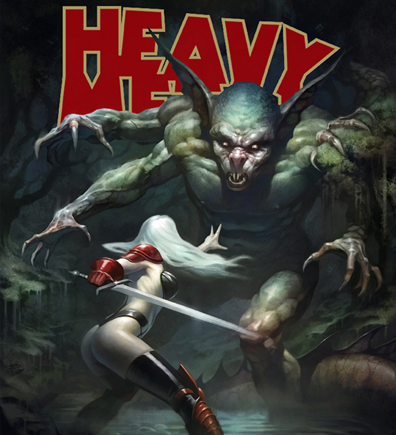
While selecting our Heavy Metal challenge winner, we had a challenge ourselves – to find a design that felt both like classic Heavy Metal while also feeling original. And Patrick (Preilly) Reilly’s design “Taarna Returns” – which imagines Taarna’s life after the ’80s movie Heavy Metal starring the character – totally nailed it.
Patrick’s style looks like it would fit right in with 20th century science fiction novel covers, but at the same time the subjects of his art are completely unique and present visual stories that the viewer can only guess the ending to.
We talked to Patrick about his winning Heavy Metal design, his stunning sci-fi fantasy art, and his process. Check out what he had to say below! And check out the amazing Heavy Metal runners-up here!
. . .
This is your first Threadless win and print! Excited to win the Heavy Metal challenge?
Yes! This was my first experience with Threadless and didn’t know what to expect with the challenge.
Needless to say there was some very heavy competition which lowered my expectations of winning, but I had fun nonetheless.

I love how your style is reminiscent of classic sci-fi and fantasy art of the mid-20th century – are you inspired by the art and stories of this time period? How did you start running with this style?
Yeah, I’m not exactly sure why but ever since I saw Blade Runner with its retro-futuristic 1940’s noir style, I knew there was something extra special about that look. For a long time I couldn’t figure out why those designs appealed to me so much but I think it had something to do with the fact that it included familiar elements of early 20th century time periods which a viewer could more easily relate to in a futuristic environment.
Im also a big fan of sci-fi pulp art from the ‘30s, ‘40s, and ‘50s.

What fantasy/sci-fi novels and films are you most inspired by?
As far as novels go, I’m a fan of Jules Verne, Richard Matheson, Edgar Rice Burroughs, and Stephen King.
When it comes to films, some of my favorites are King Kong (1933), Treasure of the Sierra Madre, 2001: A Space Odyssey, Star Wars, Raiders of the Lost Ark, Blade Runner, Jaws.

How did you learn your craft?
My dad used to do some silly cartooning when I was younger and I picked up some tips from him and began drawing all the time, and I also took art classes in high school. I then began picking up books on art techniques and rules of illustration.
One of the things I became obsessive about was trying to master diverse styles in art, ranging from comic book style, cartoon style, painterly style, and even anime. I figured if I could broaden my styles I would have a better chance at landing a job or a project.
I also spent plenty of time studying anatomy, composition, lighting, and color. I used lots of references when I was younger (and I still do) but I wanted to try and get a good grasp on these elements so I wouldn’t have to rely on references all the time. I think that helped a lot.
You submitted a few designs to this challenge – is there a story behind “Taarna Returns” or any of the others?
Well, some of my earliest memories of Heavy Metal were the covers during the mid- to early-‘80s. This was back when Frank Frazetta, Boris Vellejo, Richard Corben, Hajime Soroyama, etc. were the dominant forces in fantasy sci-fi cover art. I tried submitting pieces that retained that style and encompassed the subject matter of that era. I wanted to recapture the earlier style of Heavy Metal; The barbarian going into battle, a robotic humanoid soldier, a warrior in a life or death struggle with a supernatural beast, a sexy female scout surveying a mysterious alien landscape.

As for Taarna, the Heavy Metal film was obviously the inspiration and it was one of my cult favorites growing up. While B-17 was my favorite story, Taarna is basically the mascot of the film so I decided to revisit her to see what sort of adventures she’s up to these days.

What themes do you most enjoy visiting in your art?
Well, I like themes that involve something you would never see in everyday life, which is probably why I enjoy science fiction, fantasy, and adventure. I also try to tell at least part of a story with a single image whenever I can. I think it’s more engaging if a viewer asks “what’s going to happen next” or “what just happened here” than simply having a character posing.

I read in an interview that you started making art traditionally and switched to making art digitally – how did this change how you do art and your style?
Actually my first experience with digital art was with Mouse Paint on my Apple IIc computer during the mid ‘80s when I was about 13. It was mostly doodling and experimenting, but it familiarized me with the standard interface of digital art programs.

Years later I realized that digital art was the next big step in the industry, so I had to stay ahead of the game and began picking up every book I could find on the subject and got some tips from friends who were already familiar with digital art. I tried taking some courses on 2D digital art but at that time there were no classes available.
I first began using Photoshop just to color scanned illustrations with a mouse, then around 2005 I picked up a Wacom tablet and made a full transition. I still take time away from digital art to do traditional style though. Luckily I discovered that if you have a grasp on tradition art skills, then the hard part is taken care of – everything else is just learning how to use the tools in the program.
What’s the biggest struggle when creating art for a client?
The biggest struggle is probably trying to create what they’re envisioning. It’s very difficult to crawl into someone’s head and see what they see through their eyes. It requires a lot of questions and specific details and plenty of revisions.

You have an art book as well! Tell me a little bit about it, what was the process of curating your book like?
It’s basically a random collection of my works. Some pencils, some digital, and I tell the stories behind the images and show some of the process of my work from pencils to finished painting.

It’s self published through a small, small comic book company that I’m partnered with called Creature Entertainment. It’s more of a small project that we mainly sell at comic conventions. The guys at Creature were pretty cool. I came up with the basic structure of design of the book and the guys laid it out and polished it off.
What to you is an indicator of a good piece of sci-fi or fantasy art or literature?
What I like in a good piece of art is something that displays a specific mood (either with lighting or color), adds a sense of mystery, and tries to at least tell a story with a single image. Something that draws you in and envelopes you in its world.


