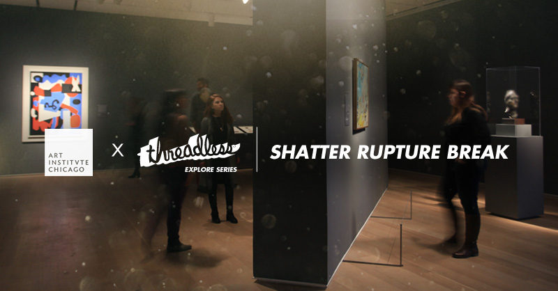
Last February, we officially kicked off a partnership that we’re extremely excited about: the Art Institute of Chicago X Threadless Explore Series. Considering the Art Institute of Chicago is rated the number one museum in the world, we’re thrilled to be working alongside them to inspire our community to create incredible art in exciting new ways. Our very first design challenge in the series centered around the AIC’s current exhibit, “Shatter Rupture Break”, which highlights work created post World War I as artists responded to the cultural shift into modernism. We asked our own artists to reinterpret this revolutionary era through their own creative lenses, and were amazed at the work that resulted.
Today, we present to you the winner of the challenge: Mathijs Vissers, for his design “Builder’s Downfall”. Read on to learn more about Mathijs and his winning work, and shop his new design here!

Congratulations on your winning “Builders Downfall” design for our Art Institute of Chicago X Threadless Shatter Rupture Break design challenge! Why don’t you tell us a little bit about yourself?
Thanks so much! I’m Mathijs, I’m 25 years old, and was born and raised in the Netherlands. I grew up drawing lots and still draw lots, although not as much as I’d like, as life and stuff get in the way, you know. Wouldn’t it be awesome to live in a cave and draw without end? I also really like movies, and strongly dislike cheese, which is sort of stigmatized in this country. As you can imagine, people really love their cheese here. I feel like I’m using the c-word too much. Peanut butter is my favorite thing to put on bread. As fate would have it, in Dutch, the word for peanut butter is ‘pindakaas’, which literally translates to ‘peanut cheese’.
Are you a history buff? If so, what parts of history interest you most?
 Not really, to be completely honest. I like good stories and there are a lot of those to be found in history, of course, but it needs to be attached to something for me. Take visiting Versailles, for example. While actually standing there in the palace, it became incredibly interesting for me to find out its history and the people that made it. If you learn about history in the moment, you have something real to attach it to.
What did the idea of “Shatter Rupture Break” mean to you
personally?
‘Shatter Rupture Break’ sparked the notion of something that has been destroyed and is to be rebuilt. At some point, everything shatters and people will always rebuild, either in the same way or amazing new ways.
In what ways did you examine this historical period to ultimately inspire a concept?
I didn’t study the historical period itself so much, but more what resulted from it. The examples inspired me and steered me in a visual direction. The idea formed to do a sort of Cubism-inspired fragmented piece and move away from my usual illustrated work. I searched for other means of creating interesting visuals, and I landed on photographs.
How did you come up with your final design, and how did you go about creating it?
I began by browsing the internet for photographs I could use. I had stumbled upon some really great public domain image libraries a while back, and thought I’d use some of those for this project. While scavenging across the various public domain image collections, I found a whole bunch of amazing stuff and selected four photographs. These four featured interesting shapes and colors and seemed to combine quite well.

The concept formed itself around those photographs, which tells a story of the downfall of great accomplishments. It all shatters, it all falls apart, it all crashes, in one day.
After cutting out the interesting parts of the images, I stacked them together each on their own layer.

On a new layer, I scribbled a whole bunch of lines to create little shapes I could cut out.

After cutting all those little pieces out, I sorted them and started to arrange them into an interesting thing to look at.
 I wanted a strong diagonal movement in there to symbolize the progression, but also cut it up with straight vertical lines to symbolize the disruptions that come along with or are a precursor to progress.
 After arranging everything, I started the flowing of color from one shard to the next, creating new shapes in the process. To accent the new shapes, I highlighted edges and added shadows for more depth.

That process repeated itself a few times; adding, removing, reshaping. To finish it off, I added some color corrections and some minor touch-ups.

Afterward, I went straight on to a new design using this method because it was way too much fun to do this. It’s creating by combining things into something new. If you’ve never done it, you should give it a shot.
Part of the prize pack includes the winning design being featured  digitally on the walls of the Art Institute of Chicago. How does it feel
knowing your design is going to be on exhibit at the number 1 museum in the world?
One of the most awesome feelings ever. I still can’t really fathom it; it’s an incredible honor. I’m totally going to brag about that one to my friends!
In addition, you’ll receive a modern art book library curated by the Art Institute of Chicago. How do you plan to use it to benefit your art?
I’m really excited for this package; I can’t wait to see what the selection is. Working in this style was so much fun for me, and it definitely boosted my inspiration a bunch. Having a library of awesomeness to inspire me is only going to add to that and hopefully propel my work into new and awesome styles I never expected to arrive at.
Any other shout-outs?
Hoi Nina!