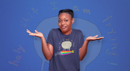
In the shadows, where most fear to tread, Halloween thrives—not just for a fleeting night, but all year round. It’s that deliciously eerie time when the dead might just whisper in your ear or the chill you feel isn’t just from the wind. At Threadless, we don’t just tip-toe around graveyards for fun on October 31st. We revel in the macabre daily, making every dusk a dance with darkness. So, dear reader, venture if you dare, as we dissect the minds of some of Threadless’s most spooky artists. A word of caution: once you’re in, there’s no guarantee you’ll come out the same.

“The great thing about tarot is that each card tells a story and is rich in meaning and symbolism. So for an illustrator, it’s a wealth of creative opportunities.”
Abigail Larson, Hugo Award–Winning Illustrator

Your work is deeply rooted in fairytales, folklore, and ghost stories. How do you decide which stories or elements to depict in your artwork, given the rich tapestry of inspiration available?
Abigail Larson: I’ve spent so much of my life reading scary stories and fairytales, so I have a lot to choose from! But inspiration hits randomly, so I tend to just go wherever I feel inclined at the time. I was really into learning about Yokai for a while, so I drew inspiration from Japanese ghost stories, and other times I’ve gone back to Grimm’s fairytales (like Snow White, Little Red Riding Hood, and Sleeping Beauty) for other pieces. And then there are some I’ve tried to adapt in my own way, like Beauty and the Beast. I like to just pull basics from the stories, and interpret them with my own taste and style for gothic imagery and 19th century aesthetics, which can be a little dark and grim already.
Tarot decks seem to be a recurring theme in your recent projects. How did your journey into illustrating tarot begin, and how do you infuse your own unique touch into such a traditional art form?
AL: I’ve wanted to make a tarot deck ever since I started art school, and had some sample images in my portfolio for years before I was approached by Llewellyn Publishing about a tarot pitch they had that they thought I’d be perfect for. By that time, my work had been floating around online for years, and they could tell my dark fantasy work would fit perfectly for their “Dark Wood Tarot” project. It was a perfect match, and I learned so much about tarot while working with Sasha Graham on that deck.
After that I was contacted by Insight Editions to collaborate with Disney on Tim Burton’s “Nightmare Before Christmas” tarot deck, which I couldn’t say no to! And after that came the Horror Tarot, which I had a lot of creative control over. The great thing about tarot is that each card tells a story and is rich in meaning and symbolism. So for an illustrator, it’s a wealth of creative opportunities. I like being able to interpret it in my style, while still holding true to the tarot’s original meaning so that readers can enjoy it for being a different kind of deck, but still be able to easily read the cards they’re working with.

You’ve worked with various notable companies such as DC, Universal, and Netflix. Can you share a behind-the-scenes story or experience from one of these collaborations that left a lasting impact on you?
AL: Every project has been a wild ride. I learn a lot each time, because so many projects are all so different and require specific skills. Going from illustrating books, to comics, to game art, to concept art for animated shows is a juggling act. I have to be able to learn quickly and problem-solve on a tight deadline, while still being creative.
Working with Netflix Animation was my biggest recent job. I was one of the character designers on Blue Eye Samurai, which comes out November 3rd. I’d never been a full-time employee at a studio before; normally I work freelance and just turn work in as I go. But this was a huge project with a really incredible team of artists, and the scope of the work was enormous. So many details, costumes, hairstyles, and different versions of each character as they progress and change throughout the story was really a great challenge for me, and it completely changed my workflow from then on. (In a good way!)

Anything else you’d like to share?
AL: I’m working on a few really exciting projects now, but they’re all under NDAs, so I can’t go into detail on most of them—but I’m working on my fourth tarot deck now, and it falls right in line with my style. I can’t wait to announce it! And check out Blue Eye Samurai on Netflix on November 3rd!

“When placed on the body, [eyes] represent how the person is feeling internally, like you’re peeking into their insides. When placed outside of the body, it is this all-seeing, all-knowing, lurking eye that’s hyper-fixated on your every move.”
Michelle Avery Konczyk (Velvet Mush), Painter

Your artwork paints a vivid picture of duality—light and dark, beauty and decay. Can you share more about your personal journey and how it led to this distinct theme in your art?
Trigger Warning: Cancer, Death
Michelle Avery Konczyk: At the age of six, both of my mom’s parents died of cancer. It was about a year of constant hospital trips, and it was at an interesting point in my brain development because I very distinctly remember understanding what was happening but obviously I couldn’t fully grasp the concept and the complexities that follow suit. This also meant a year of living this home life, but then I’d go to school and be in this bright classroom talking about happiness and singing songs and reading books.
I could go into more details of this event but to keep this light, I’d prefer to simply state that experiencing this at such a young age, I think shaped my relationship with the concept of death in a way that it otherwise wouldn’t have. And I think that the good and bad, light and dark, beauty and decay, is just this thing that exists in everything.
As a little side-note, my grandparents died exactly twenty-four hours apart, to the minute. My mother told me “it’s because they loved each other so much,” which I think obviously has shaped me into being the little painter Sylvia Plath that I am today.

Eyes play a pivotal role in your artwork, often displayed in unconventional ways. Can you elaborate on the inspiration behind this motif and the diverse emotions they convey?
MAK: Eyes have a few different meanings in my work. When placed on the body they represent how the person is feeling internally, like you’re peeking into their insides. When placed outside of the body, it is this all-seeing, all-knowing, lurking eye that’s hyper-fixated on your every move. I like to paint eyes dripping out of themselves, or fading into ribbon-like strands that connect to various things outside of the body, which is meant to be all of your insides melting out of yourself—a feeling I think we can all relate to after these past few years.
You describe your paintings as “intricate journals.” How do your daily experiences, emotions, and thoughts influence a new piece?
MAK: I like to assign my own symbolism to motifs, think of it like talking in code words with your best friends, and then I put those symbols directly into my paintings. So they’re little messages of the things I need to say, or want to say, or am feeling. When I need to get something out or don’t want to feel a certain way I use this code system to say it and express myself. It’s become a really great outlet, which at first I felt weird and hesitant diving into, but currently I’m making it be the only creative goal I have.

Anything else you’d like to share?
MAK: My very first book cover came out this month!! You can find Before The Devil Knows You’re Here by Autumn Krause everywhere books are sold.

“…every year the Walpurgisnacht is a big spectacle [in the small village I grew up in]. With witches meeting next door, this undoubtedly influenced my art, but also life far away from the big cities. Old villages that seem to be stuck in the past, little forests and hidden ponds—a lot of places where a little bit of magic could hide.”
Sarah Richter, Illustrator

Growing up in a small village, how did your surroundings influence your inclination towards magical and mythological beings? Are there any local legends or tales that have shaped your art?
Sarah Richter: I grew up in a small village near the Harz. This is a low mountain range in the middle of Germany with its highest mountain called the Brocken, or also Blocksberg. This is where the Walpurgisnacht takes place and the witches meet with the devil, according to the local legend. Even Goethe wrote about it in his tragedy “Faust,” and every year the Walpurgisnacht is a big spectacle. With witches meeting next door, this undoubtedly influenced my art, but also life far away from the big cities. Old villages that seem to be stuck in the past, little forests and hidden ponds—a lot of places where a little bit of magic could hide.
Book covers are an essential element of a book’s identity. When illustrating for a fantasy story, how do you capture the essence of the story while also infusing your personal touch?
SR: This is always a bit like doing the splits. Most customers know exactly what they want on their book cover. Then it’s for me to decide if this is feasible. Some customers let me present a few ideas and we go on working on the idea the customer likes best. In the end you never know how much space there is for a personal touch and this is why I started to move away from commissions. Nowadays I spend more time painting my own ideas and licensing them to different companies.

Shifting between digital and traditional mediums, how do you decide which method suits a particular project? Do you feel one medium allows for more expression or freedom than the other?
SR: For most of my projects I use both mediums in different stages of the artwork. When I develop a new motive and gather ideas, I like to sketch with pencil and paper, mostly sitting in a cozy place on the couch with a cup of tea. This seems to work best for me in the creative phase. Lines on the paper that even a rubber can’t remove properly, a little kink in the paper, dirty hands from the graphite—this type of chaotic environment seems to help bring new ideas to life. If the idea is grown up and all the lines have found their place, I digitize the sketch and start to add more details and color digitally with my drawpad. I can play around with colors and shading and have the freedom to adjust and change things more easily later on.

Anything else you’d like to share?
SR: For all of you who are interested in coloring my art, I just released my third grayscale coloring book called Kuntergrau. Thank you so much for your support and interest in my art!

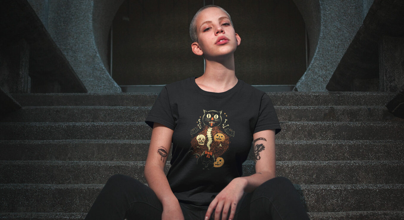
“[Halloween is] tending to your community and environment, making sure you and yours have enough to get by through the hard times and dark half, celebrating hard work and togetherness, looking to those that went before for guidance.”
Sam Heimer, Illustrator

Your illustrations are rich with Halloween–themed imagery including skeletons, jack-o-lanterns, and monsters. How did this deep connection with Halloween develop, and how has it shaped your illustrations and toy-making?
Sam Heimer: Since childhood, Halloween is the only holiday that made any sense to me. It’s not marred by organized religion or based on nationalism and war. It’s tending to your community and environment, making sure you and yours have enough to get by through the hard times and dark half, celebrating hard work and togetherness, looking to those that went before for guidance; it’s rooted in harvest holidays. And if you follow those roots, Halloween is the oldest holiday. Since the start of agrarian practices, be it through solemn reflection or raucous feasts and bonfires, people have noted the Harvest and the coming of the dark half. Because of these aspects, I see Halloween everywhere in my day-to-day life. That is why I believe Halloween, much like the veil, is the ebb and flow of a grand tide, not a singular day.
Your work with HH Toys is a fascinating extension of your artistic portfolio. What goes into the process of creating a spooky toy, and how do you envision people engaging with them?
SH: HH Toys started out as a passion project in-between inking, but quickly grew into something bigger. I am an awful 3D artist, but have always wanted to see my work take tangible form, and finding artists (sculptors) that can translate my line language has been incredible and fulfilling. The process is typically an odd idea or joke, rough sketches to tighter sketches, then sent to one of the sculptors I work with, revisions, and then into prototyping and production, which I handle personally.
Most folks just put them on shelves, but on occasion our customers take them out into the world, a little bit of fun in the pocket while you go through whatever rock you’re pushing uphill. Some customers photograph them, make dioramas and displays with them, and even occasionally, play with them. These latter ones bring me a lot of joy.

Tell us more about The Order Of The Thinned Veil. How did the idea for a tiered Halloween-themed subscription service come about, and what can subscribers expect from it?
SH: The Order of the Thinned Veil grew out of discussions with Jason McKittrick (@the_cryptocurium), an amazing sculptural artist, Halloween enthusiast, and friend of mine. We wanted to figure out a way to both celebrate and create Halloween art all year. We create the art at the end of winter, open subscriptions up in the Spring, and depending on what level you subscribe at, you get Halloween in the mail for a few months from the end of Summer straight though Halloween. The offerings span art prints, resin sculptures, plaques, toys, membership pins and certificates, lore and more. If come November 1st you’re yearning for more Halloween, check us out on instagram at @orderofthethinnedveil.

Anything else you’d like to share?
SH: I have some irons in the fire with Waxwork Records and Unbox Industries. Some personal work and toys coming out. All will be announced on my Instagram. Beyond that, I’d like to wish you all a happy, healthy and cathartic Halloween and a robust Harvest.
As the witching hour approaches, we’d like to extend our deepest gratitude to the incredible artists who’ve shared their haunting visions with us. To our readers, if you’ve been spellbound by these spooky artists, we invite you to explore their designs further on Threadless. Who knows? You might just find the perfect piece to showcase your love for all things eerie. Here’s to celebrating the macabre, not just this Halloween, but all year round!