As Kubo would say, “If you must blink do it now (because you won’t be able to look away from this design!)”…ok, maybe he never said that last part. But Michael “DinoMike” Buxton’s winning design for our Kubo and the Two Strings challenge is certainly stare-worthy!
We talked to Michael about his Kubo win, his Threadless winning streak, and a little bit about what he’s got planned art-wise for 2017. Check out the interview below!
. . .
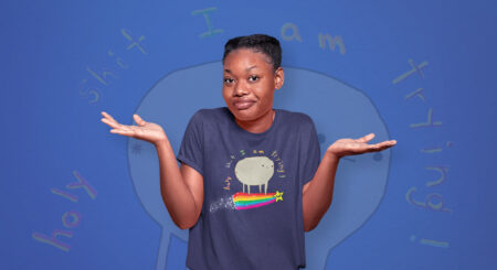
Wow, you are on a serious roll! What gif best describes your reaction to the Kubo win?
My gif game isn’t as strong as some people, but I think this one is pretty accurate:

You seemed pretty stoked about this win! What were you most excited about? Is it safe to assume you’re a fan of Kubo and the Two Strings?
Well I’m a HUGE movie buff, so any film-related competition grabs my attention. And if it’s an animated movie then I’m going to go all in. And yeah, I loved it. The scale of it was amazing but it still managed to tell a really emotional story at the same time. The animation was stunning and it blows my mind to think of the work that went into it.

You mentioned that you’re a fan of LAIKA studios too! When did you first fall in love with it?
Right from the start with Coraline. What LAIKA does really well is that they’re not afraid to make things pretty dark and genuinely scary. I think a lot of children’s films can be a bit patronizing to kids, so it’s really refreshing when one pushes the scare factor a bit. I grew up with stuff like Return To Oz, Watership Down and The Secret of Nimh. Stuff that builds character while scarring you for life.

What was your process for creating this design?
Well I wanted to design something that got across Kubo’s emotional state and how important his music is to him. At the start of the film he’s really sheltered by his mother and has a lot of questions that she can’t answer. So he has a lot of frustration building up that he uses his music to help with. While at the end, he’s come to terms with his family history and finds acceptance. So this design can sort of represent both sides of the story.

This looks a little different than your normal style: was this design a challenge?
I love the art style of LAIKA films, how everything has a quirky, slightly angular feel. So I wanted to try and replicate that. The most difficult thing was the colour, there’s a lot of tones going on so it was really tricky to balance everything out.

Favorite moment from the movie?
The giant skeleton sequence is just amazing. I think it’s the biggest stop motion character every made, and the size of it really comes across. And the sisters were just nightmare fuel.

2016 has been quite a year, but you’ve had a lot of wins and designs printed, which is great! What are your 2017 art goals?
Yeah, despite all the carnage of 2016, I’ve had a pretty good year career-wise. Next year I can hopefully build on it and get a few more prints! And I have a children’s book coming out in April that I’m really excited about, so I’m hoping that that could lead on to other things as well.
So I just wanted to share the amazing #Kubo prizes I received from @threadless and #LAIKA Thanks so much to everyone who voted! pic.twitter.com/K4GMdPu5Zh
— Michael Buxton (@dinomikedesign) November 23, 2016
That’s awesome! What’s been your favorite win so far?
They’ve all been amazing experiences, but I’ve never won a prize as cool as the Kubo competition! But in terms of performance, I still can’t believe how well “Free Hugs” has done. It didn’t actually score that well when I subbed it, and I was really surprised when I was told you guys were printing it. But it’s become a bit of a monster. And now it’s a pin too!

Anything else?
Just a huge thanks to the community on here for being consistently awesome, and I hope everyone’s 2017 is better than this train wreck of a year.


